Tuesday, December 9, 2014

Castle Overlooking a River

The drawing I analyzed is called “Castle Overlooking a River,” located at The Getty. This charcoal drawing is very simple yet incredible. Maxime Lalanne, a French painter and printmaker in the 1800s, created it. Many of his paintings are actually a call for a political protest. During the mid 1800s, when France fell into its Second Empire, Lalanne drew paintings of political symbolism to criticize the living conditions of their country (in terms of industrialization and poverty). This painting is a reference for one of his many architectural drawings that show a quiet side of France, opposed to what he usually drew. It encompasses the nature and true beauty of France despite the fallen side to it (slums).  
This drawing caught my eye because it covers one of the drawing elements we were required to do for this course. It focuses on the simple sketches and use of charcoal in a 15 ¾ x 11 5/8 in. piece. Through charcoal, Lalanne was able to intensify the nature by making it look as realistic and serene as possible. It almost looks like a really quick sketch but the amount of detail stops it from making it seem so easy. For example the color, there really isn’t any besides the vintage look due to the time the drawing was created in. charcoal isn’t meant to have color, just color in terms of composition and themes. I think the painter captured the essence of a calmer and less industrialized version of France in the late 1800s.

Something inspiring about this piece of art is the technique he used to create the piece. For instance, one could automatically notice how he used soft vine in the background of the artwork. He might have used lighter shades of charcoal in the upper left and upper right hand side of the trees. Then he finally used a darker charcoal to intensify the details of the tree trunk, bushes, and part of the trees. The texture of the paper helps bring out some of the strong elements of charcoal. At a distance, we can actually see the castle to the left hand side to maybe portray how close yet how far we are to nature in comparison to the industrialized areas of the world, which seem close and persistent.

Esterio Segura


 Lisa King
I thoroughly enjoyed my visit to MOLA (Museum Of Latin American Art), where I viewed the artwork of Esterio Segura. Esterio Segura was born August 22, 1970 and had an interest in the visual arts at an early age.
 He studied at the Escuela de Artes Plasticas of Camaguey Cuba from 1982-1985. He began his instruction a few years later at the Instituto Superior de Arte in Havana, which he finished in 1994. With a backround in sculpture he is equally known for his drawings, painting, and prints. Additionally, recently he has begun adding text to his artwork. Images from mythology, popular imagery, religious art, and art history are subjects utilized in his work. Recurring themes in his work include eroticism, religious rituals, and the use of symbols.
I was quickly and readily able to relate to Esterio Segura’s work. The display of his artwork was primarily very large in mixed media pieces. The composition appeared to have evoked strong emotions and thought provoking images. I found it to be quite delightful visually, it also succeeded in stimulating my mind which is an enjoyable experience. The themes utilized referenced as metaphors, visually combining them in his open-ended syncretism. I especially loved the apparent chaotic and hybrid context in which his works offer contradictions that allow Segura to allude to universal dilemmas.
There were numerous pieces that I really liked by Segura. It would be difficult to pick just one. I contemplated many different ideas and interpretation of his work. I saw several components of his work which I could relate to topics covered in class, such as perspective and line variation.
 I truly enjoyed visiting The Museum Of Latin American Art. Esterio Segura has now become one of my favorite artists, due to the fact that his work is not only thought provoking but visually intriguing as well.


Twins By Alex Gross at Long Beach Art Museum (Ricardo Cubillos)

Ricardo Cubillos
Drawing 15
Museum Visit
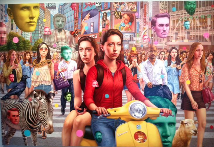
TWINS BY ALEX GROSS
The artist Alex Gross was born on August 30, 1968 in Roslyn Heights, New York and  currently works in Los Angeles, California. His work is mainly done in oil paintings on canvas, and he focuses on the modern era with great deal of color variations that represent the regret of passage in time a globalization, and commercialization. He graduated in 1990 from Art Center College of Design in Pasadena, California and he has then taken part of the pop surrealism movement. During the early 2000’s he spent two months traveling through Japan in search of Japanese Fine Art and Commercial art; later in 2004, he would publish his collection work with a title Japanese Beauties.
    Untitled.png

    The painting TWINS currently located at the Long Beach Art Museum has a big representation of color spectrum mostly accomplished by warm colors in which the entire painting is able to capture the viewers eye by having an strong impact with such a colorful painting. The artist uses all warm colors in his painting to accomplish that and bring the entire image in front of the viewers eye. He is able accomplish the expression of the globalization of a modern world’s main activities, mixtures of all cultures and now are so close together due to the technological advances, which he also points out in his painting by contrasting a Buddha sculpture in the middle of all the modern tall buildings. Even with warm colours, he expresses some horrendous images of some commercial marketing, and he contrasts those with a different perception of pleasure; he uses the same colour spectrums between the two interpretations to represent the confusion on the modern world. The artist uses perspective composition in which he starts by having two girls in the front of all the crown and the buildings dissipate to a one point perspective straight to the viewers eyes where all the buildings are directed. The one point perspective works so well in this piece because he is able to express globalization as one, where every person is coming towards the front of the painting.
    This painting had an impact on me mainly on the way the artist chooses to use the warm colors to catch the viewers eyes; he chooses to stay on the warm family of the spectrum. The painting gives me idea of a composition on a good representation of a one point perspective in order to express this particular idea in his composition. However, I may choose to use a two point perspective in my composition.
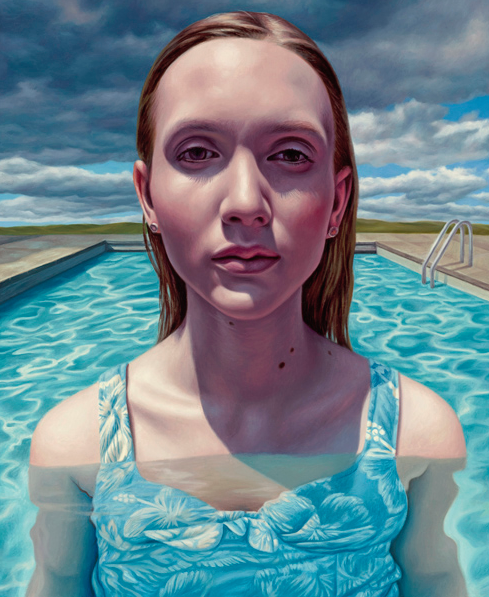
Following are some of Alex Gross works:
1.png

Monday, December 8, 2014

Sophia Villalobos


Esterio Segura - Museum of Latin American Art

Esterio Segura
Esterio Segura born in August 1970 in Santiago de Cuba, Cuba became well know for some of his controversial works of art. Born and raised around political and social turmoil in Cuba, his works give an inside look at what it was like being living in Cuba at the time. Esterio's work has a lot to do with migration, censorship and cultural isolation and his works usually include mixed mediums such as, charcoal, acrylic, pastels, graphite pencil and perhaps some conte crayon. Cuba wasn't the greatest place to live at this time, Esterio wants to show the world his experiences of the Cuban turmoil. The Museum of Latin American Art is displaying some of his amazing work from November through February 2015.

This picture on the left, has got to be my favorite by him (unfortunately I didn't get the title of the work) but as soon as I saw the painting I was drawn into it. The picture depicts a man with demon like dragons attacking him from all sides. They come for his eyes so he's not a witness and does not see the errors and misfortunes of the society he's in, but one thing that really stuck out to me were his hands. At a first glance it looked like they were just attacking his hands, but when I looked closer, the only thing that was being attacked were the mans middle fingers. During the time Esterio was living in Cuba you could not state your opinion, let alone go against the governments, you either had to keep quiet and deal with whatever was going on or you could be killed. It was that simple, yet horrifying.
Fly Away - 2001


Another thing that caught my attention in his works is that he seems to draw a lot of ways to travel as in: airplanes, cars, boats and submarines, why could this be though? In Cuba under the rule of Fidel Castro you were not allowed to go in or out of Cuba. The dream was to escape the communist rule in Cuba, but the reality was that you couldn't. I feel that as a child or even while growing up, Esterio dreamed of getting out of Cuba and starting new anywhere else, somewhere he could be free, speak his mind and express his artistic abilities. All of my favorite artist have been the ones that share their life and stories through art such as Frida Kahlo. Personally I'm very glad I got to see and enjoy his work. My favorite work has always been surrealism but I like that he includes real objects in his work like we did in our art class.

Saturday, December 6, 2014

J. Paul Getty Museum: A Painting of Venice by Luca Carlevarijs

  This had been the fourth time visiting J. Paul Getty Museum (also known as the Getty) for me. The Getty has collections of sketches, paintings, and sculptures, which date back to various eras; some are more than a thousand years old, and some are barely a century old. From the past three visits to the museum, I mainly focused on viewing the sculptures and the sketches, so I decided to pay more attention to the paintings this time. There were so many that I looked into, but among those, I'd like to share brief information and personal opinions a painting that caught my interest the most. But before I begin, let me announce that I will be using a picture from the Internet since the one I took myself is in an extremely low quality (my digital camera is more than a decade old and the camera on my cell phone has been broken for months).
A Regatta on the Grand Canal in Honor of Frederick IV, King of Denmark, 1711

This painting is called A Regatta on the Grand Canal in Honor of Frederick IV, King of Denmark, a work done by an artist named Luca Carlevarijs in 1711. This work had been painted while Frederick IV was visiting Venice, Italy, on a day a regatta (a type of boat racing) was held in the Grand Canal.
Born in 1663, Italy, Luca Carlevarijs was a painter, a printmaker, and an architect. What is interesting about him is that he was never formally trained as a painter but nevertheless, he was one of the excelling Venetian view painter of his era. It is known that scholars consider him as the first artist to recognize the importance of Venice as a center of International activities and depicted it in his works. He illustrated 104 views of Venice that were considered to be the most complete survey of the city, which presented him with an artistic success during his lifetime. A Regatta on the Grand Canal in Honor of Frederick IV, King of Denmark is notable in that it represents his survey of the city, and captures a historical event at the same time.

This oil painting on a 53 1/8 x 102 1/4 in canvas, despite its size, captures an enormous amount of details from the decorations on buildings and boats to the facial expression of each individual. The sense of perspective was handled profoundly by blurring out the colors of the objects far away from the painter, and by the proper application of vanishing points. The light logic seemed to be exaggerated in that the shading of the boats and people are much more intense than that of the buildings that are equidistant from the painter's view. On the other hand, this exaggeration could have been done purposefully to lead the viewers' focus towards the event (the regatta) rather than the surroundings.

Thursday, December 4, 2014

The Birth of Venus

I went to the Uffizi gallery in Florence, there I saw the very famous painting The Birth of Venus by Botticelli. It’s tempera on canvas and measures 67 x 109 inches. It is a depiction of the birth of Venus, she is in the middle of the painting on top of a shell. It is a painting, but there are a lot of contour lines around the subjects, this was before they developed a very smooth transition between light and dark. It looks very outlined especially in the smaller areas like the toes and hair. The colors are not very vibrant, they have more of a pastel look, the cool colors are not very sharp and the warms are just that. There were also little bits of gold leaf used in the trees, around the shell and in the wings of the angels on the right. Botticelli used value to show the direction of the wind by making parts of the hair and robes darker according to where the wind is blowing. He made the ripples of the robes by using value again from going from dark to light according to how it folds. But the water doesn't have that kind of dimension, the water looks very flat and the ripples are just little strips of white that are supposed to the ripples in the water. The painting was a lot bigger than I thought, i had seen it in books before. In class we learned to use light on to show light, Botticelli did this in the water and highlights of the hair, in the right side of the trees where the light was shinning through. I liked that i was able to see the brush strokes and the lines he used to make it, its one thing seeing it on a paper but when you get to walk up to it, its really nice to be able to see its “skeleton”. 


Wednesday, December 3, 2014

Anayeli Tepos, Museum of Latin America, Long Goodybye by Esterio Segura

Hello, I was able to attend Museum of Latin American on November 30 and observe several pieces by Esterio Segura. This is Esterio Segura's first solo museum exhibition in the United States. His work is infused with controversial satire, reflecting his view of Cuba's history and identity.  He studied at the prestigious Instituto Superior de Arte (ISA) of cuba where he later taught professionally.

The title of his piece of work that caught my attention is titled,  Goodbye My Love.  This is a plane shaped in a heart made out of fiberglass painted red. It's grand in size and placed next to other similar work with the symbol of the hear-shaped plane.   The piece was hanging above me and next to another piece  titled, Long Goodbye.
The medium is watercolor and pencil on paper. It's the exact replica of the heart-shaped plane but it's on paper instead of a 3-dimensional model. Although it's on paper, the plane still looks 3-dimensional because the way the artist manipulates the value of red. He still gives it a sense of flying. Although no black or white is being used, I can tell that there is a source of light hitting the plane form the top right corner. 

The plane  is leaving a trail of words. The words are just expression how painful it is to say goodbye and questioning where did she/he go.


 The reason these pieces of art caught my attention is because what they symbolize for is loss. To the artist, Goodbye my Love is a "metaphor  for being uprooted and experiencing moments of rupture, loss and release". We have all experienced "loss, rupture and release" in our lives. But the artist takes something simple- a heart. A heart that has been exploited by the media. But, Esterio Segura has taken it and turned it into something meaningful, which represents much more than just love. It represents the loss of his love leaving and the emptiness that is left behind. The words left behind from the plane symbolizes what the loss of a love leaves. His words just say that the plane took everything with him/her. It reflects love and the feelings created when people are separate from each other.

Most of Esterio Segura's painted fiberglass planes have been exhibited in public spaces such as passageways and airports. I find it kind of ironic that these would be exhibited in airports because of what they symbolize- the emptiness of a  goodbye.

 His exhibition is from November 22, 2014- February 15, 2015.